
(All information in this case study is copyright protected, confidential and must be treated with strict privacy. Non-disclosure policies apply to this project whilst in development.)
RocheMartin is a leading global provider of Emotional Intelligence Products and Consulting Services. At the helm of the RocheMartin product offering, is a comprehensive 360 degree online Emotional Intelligence Assessment Tool based on years of psychological data collated by Dr Martyn Newman, the founder.
RocheMartin’s website, ecommerce, wholesale and assessment platform needed to be rebuilt from the ground up with security, reliability, auditing, scalability and user experience as core drivers.
My Role
I have worked on the RocheMartin account for over 10 years providing creative, design, strategy and digital web application services and solutions. My various roles in this project included;
- Digital Director & Team Lead
- Lead UX Design, UI & IA
- Art Direction for Print & Digital
- Client Services & Stakeholder Management
The Process
A thorough UX process was required for this project given the history, complexities, technical implications, budgets and stakeholder expectations.
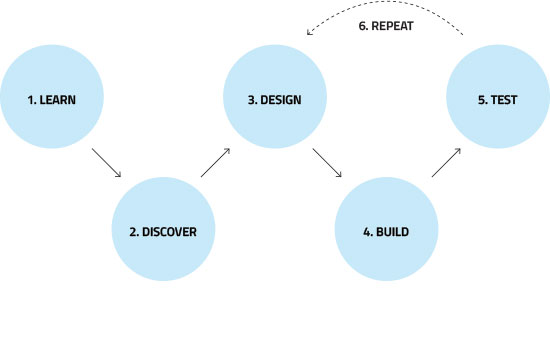
Learn
BRIEF
Scope & Definition
- Architect and design new eCommerce wholesale & retail responsive website and application to integrate with additional platforms
- Take an antiquated, 8 year old assessment platform and modernise it with cutting edge concepts and technologies and add improvements to core features and functionalities
- Upgrade ageing security policies and procedures and replace server architecture with hybrid cloud based platform
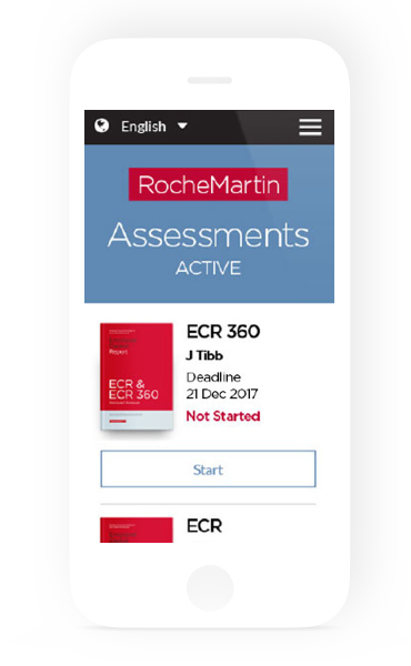
- Improve user experience across all touch points and digital channels and improve conversions on user journeys from purchasing and customer retention through to assessment completions
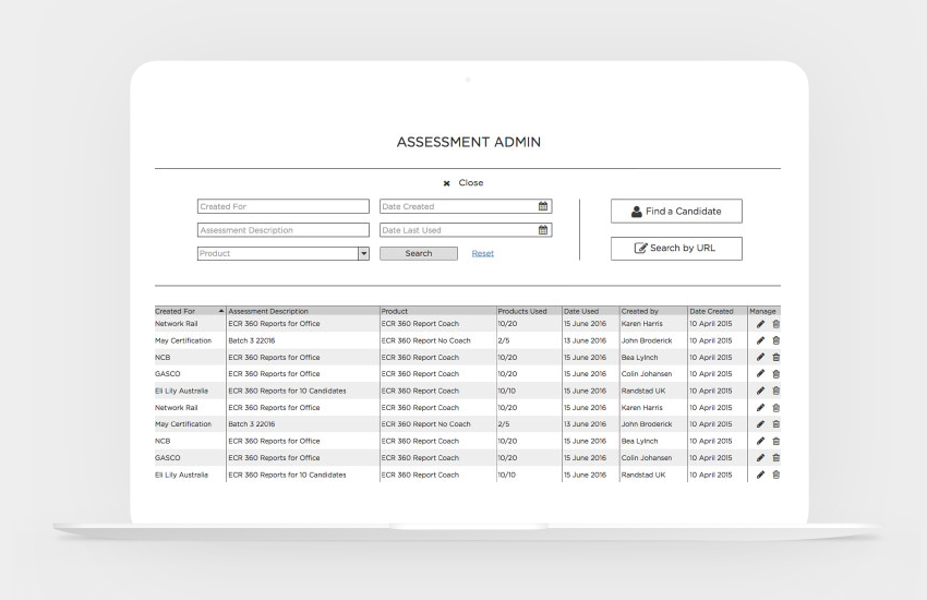
- Improve ability for wholesalers and resellers to better manage users and assessments
The Problem
Online psychological questionnaires and surveys traditionally present challenges for participation. Often they are time consuming, confrontational and frustrating. Maintaining engagement and getting 100% completion requires a good user experience. Whilst RocheMartin was a credible provider in this space the platform still required significant improvements for the users and administrators.
GOALS & OBJECTIVES
Valuable stakeholder insights were gained in regard to business objectives for the eCommerce and wholesale platform as well as user behaviours when setting up, starting and completing assessments. A number of usability pain points were identified for users not accessing and completing assessments.
- Increase user conversions on product purchasing and assessment completion
- Improve customer retention on user journey
- Improve usability for customers, wholesalers and administrators
- Improve scalability, reliability, accountability and performance
Discover
RESEARCH
Interviews
As part of the extensive learn and discovery phase, I conducted stakeholder, staff and user interviews in order to get a better understanding of the problem and objectives. A simple 10 question survey was also sent out to a sample of existing wholesale users to gather feedback on current system.
A number of business, technical and ux challenges presented itself so it was my role to ensure all parties objectives needed to be met. As I was already familiar with the assessment tool and it’s technical and responsive limitations, I was most curious about how wholesalers and users found the current system.
Competitor Analysis
I conducted a full competitor audit and analysis for every project I’m involved with. This is a critical discovery process to establish strategic design, technical and business decisions and objectives. The RocheMartin project was put through a full environmental and product scan that helped define their unique offering and value proposition in the Emotional Intelligence corporate landscape.
Personas
Based on the interviews conducted and user data research we were able to setup personas for key users that were our constant go to in regular sprints, workshops, meetings and presentations. We referred to them throughout the entire design and development process. Key users identified were candidates, raters and administrators. The challenge was the ethnographic research required for the Assessment Tool which is available in over 10 languages across 100,000+ international users. We were able to conduct research in Australia & Europe.
Content, IA & Card Sorting Workshops
I facilitated a number of stakeholder workshops and meetings during the early scoping and project definition stages and at various milestones throughout product development.
The initial purpose was to discuss the content information architecture for the assessment platform which had to integrate with a new global website and eCommerce system and a number of other 3rd party platforms.
Both open and closed card sorting was useful in gathering feedback and direction in the early stages which also provided additional insights for interactive and UI recommendations.

VALIDATE
Journey Mapping & Customer Sign Up
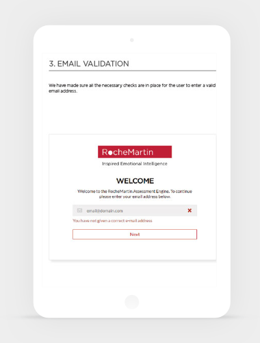
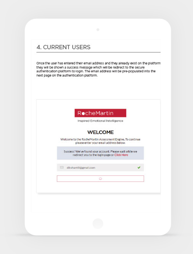
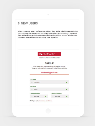
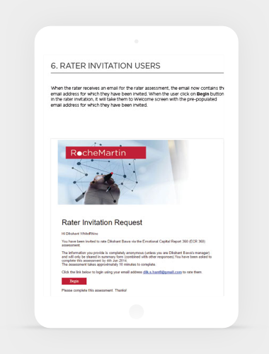
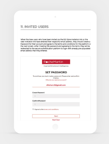
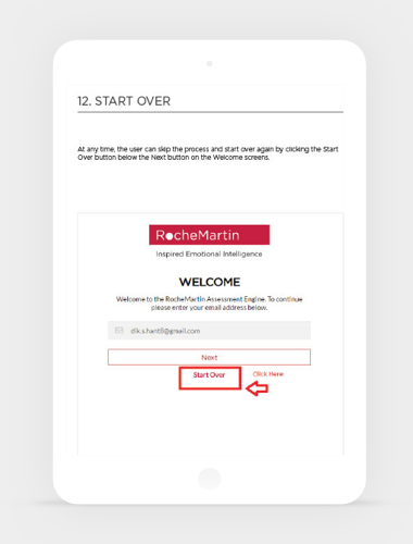
Part of the many Journey Mapping senario’s undertaken, was isolating and identifying the new user sign up experience which had to integrate with a new authentication platform. Insights were gained from analytical research data that helped define a better user experience and user testing was a critical part of this process. Testing was conducted to identify key hot spots, usability issues and road blocks in the customer journey. Post launch A/B Split testing was conducted in collaboration with digital marketing campaigns to further refine the signup experience.
Design & Build
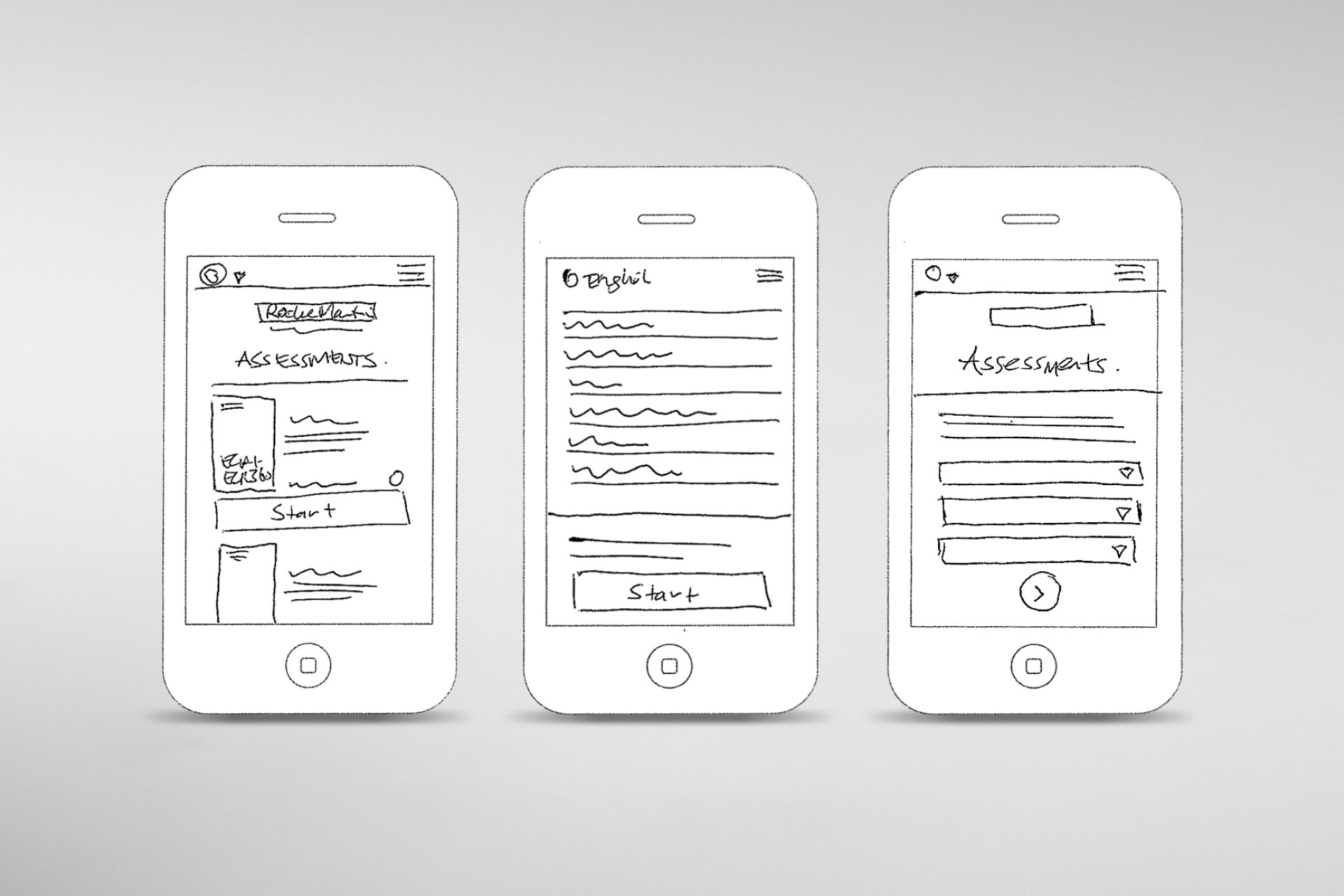
Sketches
Sketching was a massive part of the project. From tiny scribbles for informal design & dev team catch-ups to comprehensive sketches mapping out entire processes and UI for design sprints, stand ups and stakeholder meetings. Sketching enabled rapid prototype concepts, designs and iterations for the;
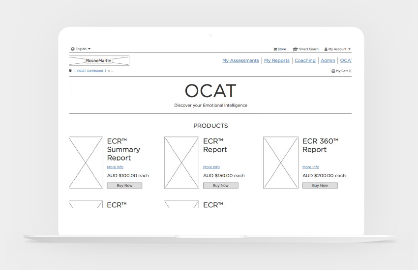
- Assessment Platform
- Survey Questionnaire
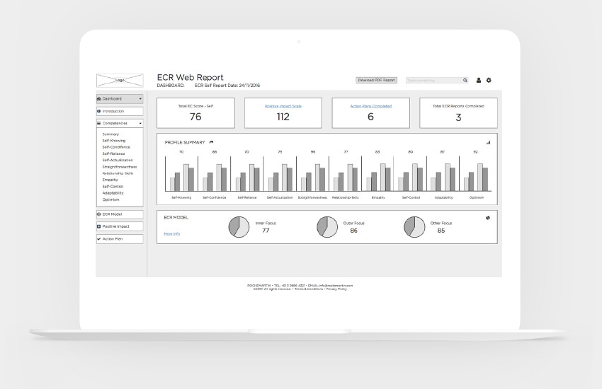
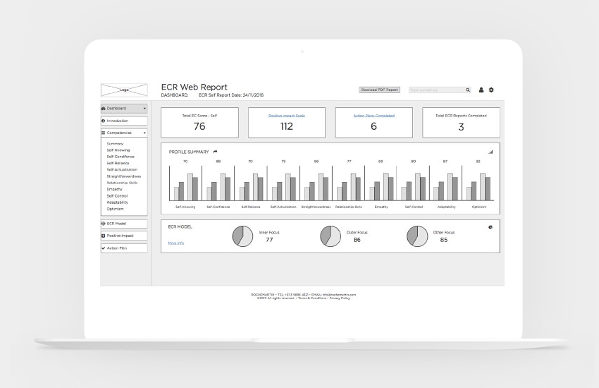
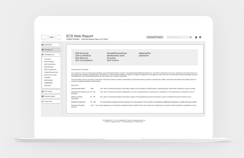
- My Account & PDF Reporting
- Product Management & eCommerce
- Wholesale Administration
- Emailing Communications
Wireframes
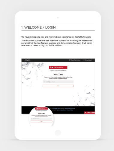
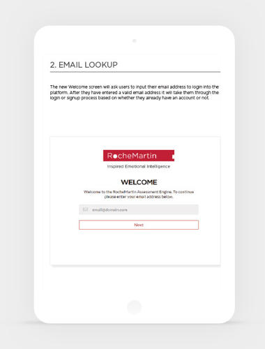
Desktop, tablet and mobile wireframes were created for stakeholders, developers and user testing purposes.
Initial low fidelity wireframes were created in Balsamiq with further iterations done in Adobe & Sketch and uploaded to Invision for review.
User case senarios were created, and user testing and prototype demos conducted via the Invision platform. Usability and IA insights were gained which were able to be applied to the final UI designs.
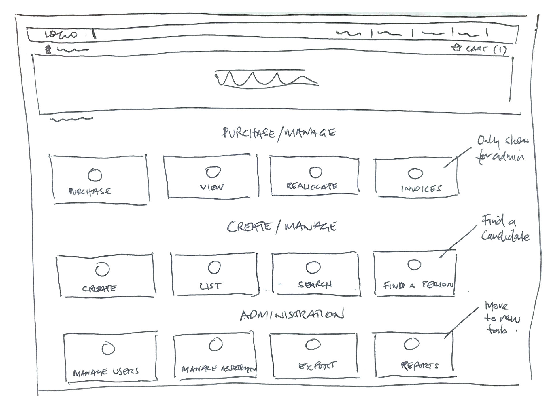
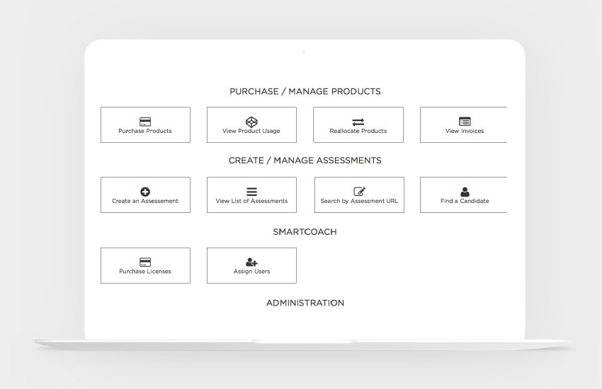
A card based layout approach was adopted for the dashboard which enabled multiple flexible solutions for the IA and UI.
UI Design & Styleguide
I worked closely with the design and development team both in Australia and Europe and lead the direction for the UI to align with a recent branding refresh completed by a European agency. I also produced a digital design systems styleguide for the project.
Clean minimal flat colour design with sans serif typography dominated the inspired direction with striking corporate imagery. The dashboard card solution for the Assessment platform inspired the simple UI direction throughout the user experience.
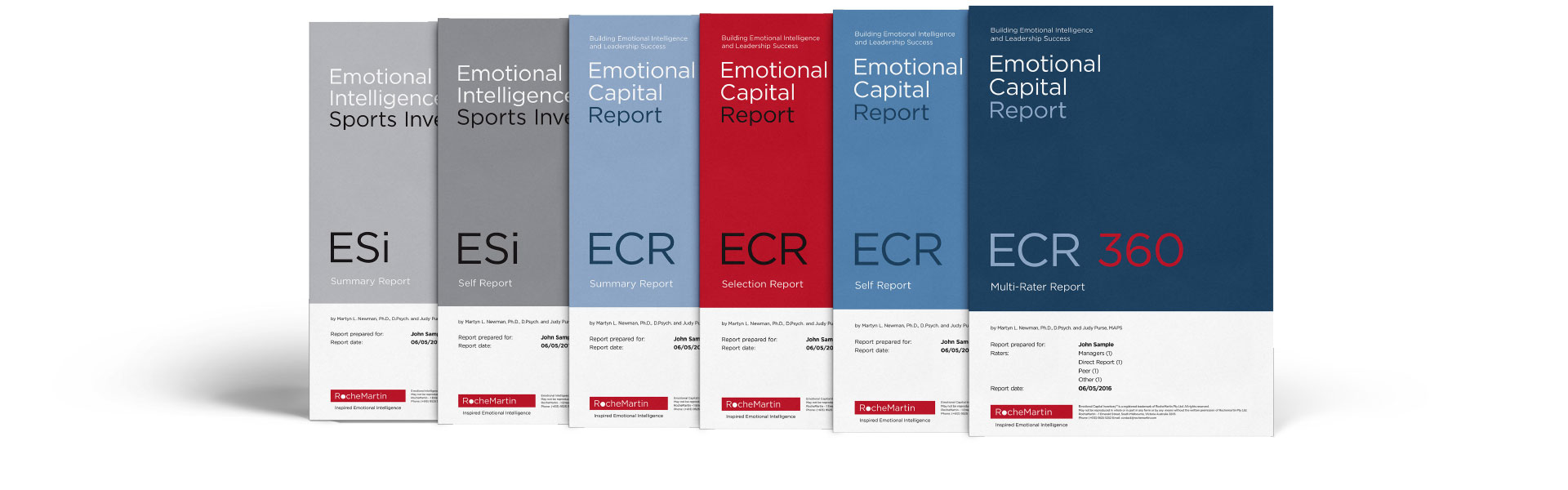
A clean, sophisticated digital product suite was redesigned for the Assessment pdf reports which was identified in the discovery phase as a key differentiator in the competitors market analysis.
Test
Design & Development Testing
I was involved every testing phase of the product life cycle, from concept through to product launch and post analysis. Testing is an integral part of my iterative lean ux ‘LEARN, BUILD, MEASURE’ process.
Sprints were conducted throughout various stages to test design and development concepts and decisions before initiating and validating via user testing. My focus was on customising and tailoring the experience for different users.
User Testing
Lo-fi & Hi-fi wireframe and design prototypes were tested during product development with a small sample of face-to-face users in 45min sessions. Users were observed and asked to verbalise feedback during the sessions and complete various tasks and processes. An additional sample of users were tested remotely in Europe via a prototype with supportive documentation for session tasks and a follow up survey questionnaire.
After monitoring user requests after first month we noticed a subset of users were finding the login and sign up process confusing. Working alongside these users we conducted usability testing scenarios and rapidly engineered a new user login experience which brought user confusion and support requests down by 30%.
Outcome
Industry leading benchmark tool for Emotional Intelligence testing
Challenges
With a project of this size there were a number of challenges that presented itself from a design, technical and user experience perspective. A main challenge I focused on was the core experience of the survey questionnaire which was back bone of the whole system. It hadn’t been updated for many years and was not mobile responsive and user frustration was evident. Rater drop off and completion was declining, and support enquires were increasing.
Solution
Ideate, Design & Test was the solution. The survey system was pulled apart, analysed and re-engineered. The user journey was mapped out and numerous iterations and changes were made to how the survey functioned and presented across devices. Alternative UI solutions were tested across language and accessibility with validation and alert prompt messaging a vital solution for user experience and communication.
Results (after 6 months)
6500 users joined (Up 15% from previous 6 months)
User enquires and issues down 30%
User assessment completion time down 25%
Rater assessment drop off down 67%
2Yrs+
Design & Build
250+
Sketches & Wireframes
100K+
International Users
350K+
Assessments
“Emotionally Intelligent Design Is The Future of Mobile UX”
Adobe Blog Article / 01-02-2018